Cliente
Hospital de Sant Pau
Services
Branding
Communication
Digital
Scenic branding
Strategy
Narrative
Sector
Health
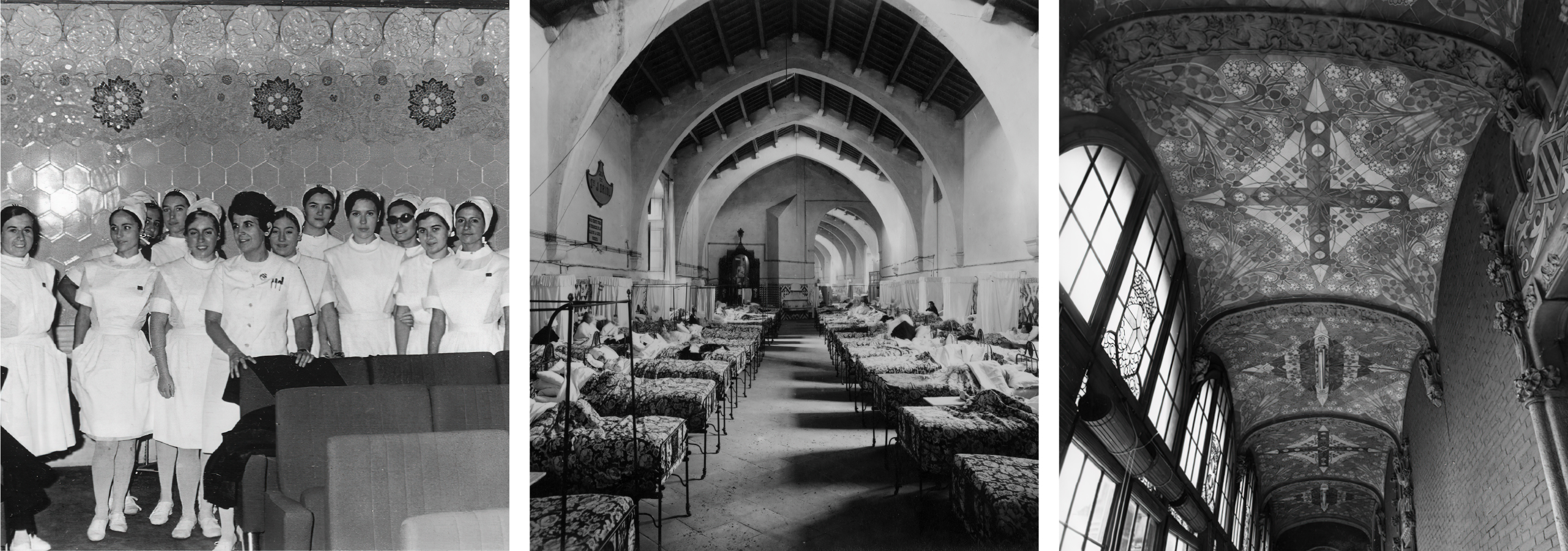
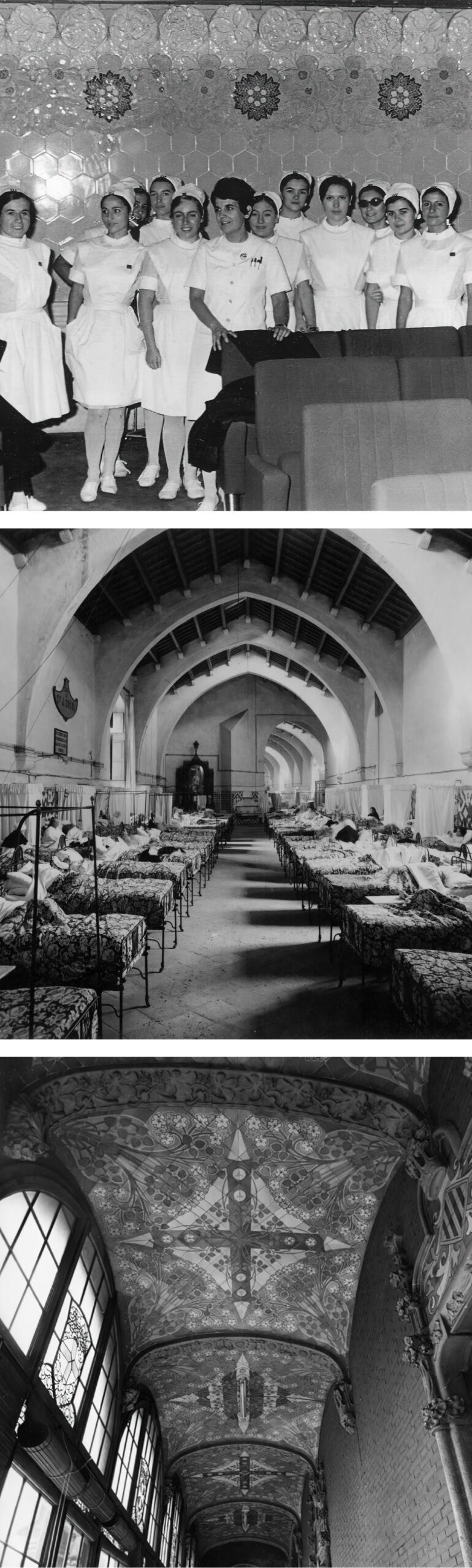
The Hospital de Sant Pau is a living history of the city of Barcelona. Since 1401 it has always been at the forefront of Catalan healthcare. It was at Sant Pau that the first heart transplant was performed, where the first emergency department in Spain was created, the first medical school and the first coronary unit.
For obvious reasons, from its birth as the Hospital de la Santa Creu, a small health centre located in the centre of Barcelona, to its transfer to the current large modernist building, the hospital has multiplied and diversified its activity, giving rise to multiple initiatives and programmes. On the one hand, these initiatives and programmes coexisted without visual coherence. On the other hand, atomisation disintegrated and weakened the Sant Pau brand.
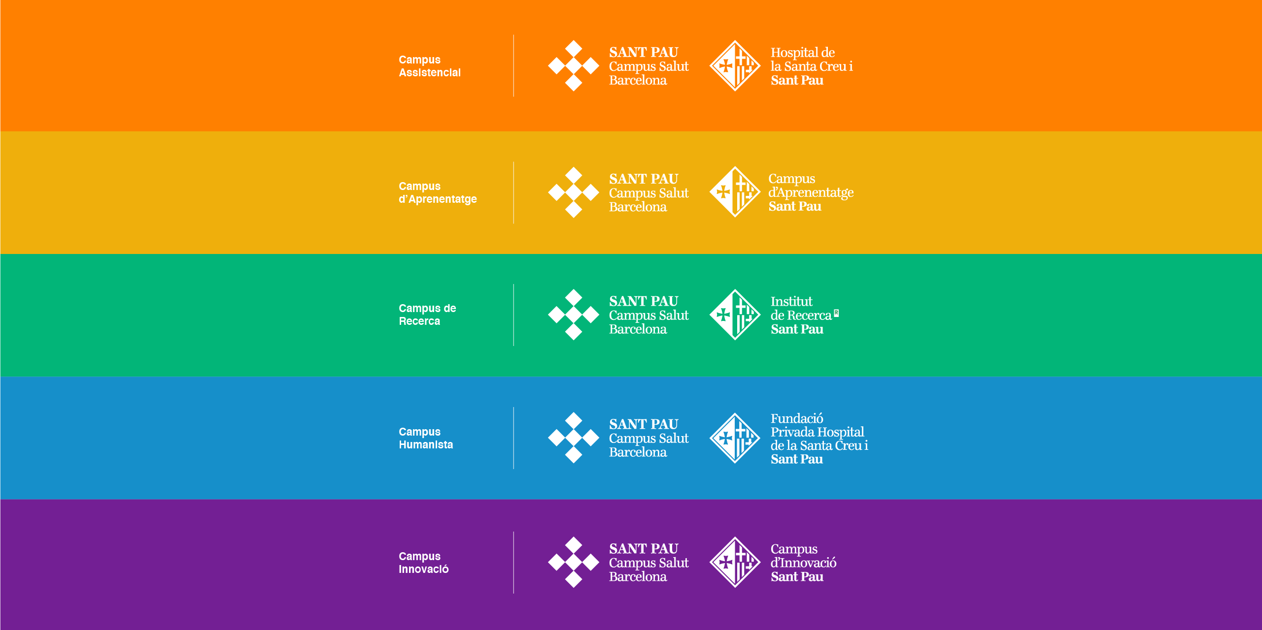
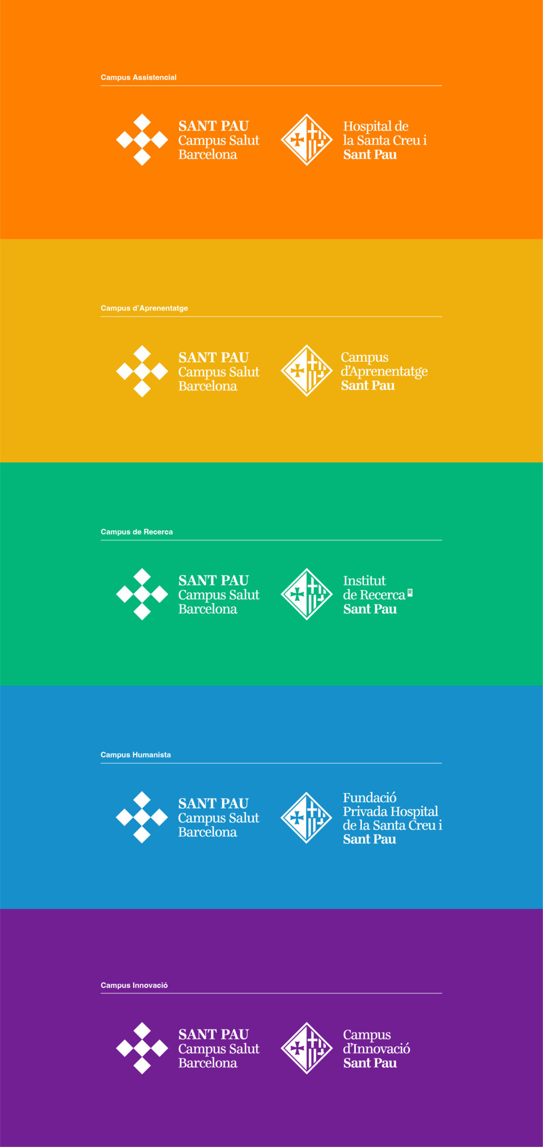
Sant Pau therefore drew up a new strategic plan and, with the aim of concentrating all its activities in a single entity, created a new umbrella brand: Sant Pau Campus Salut.
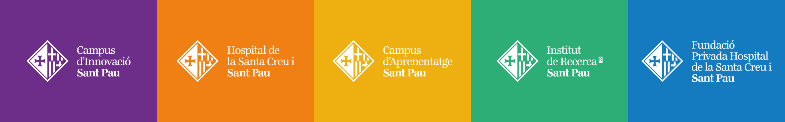
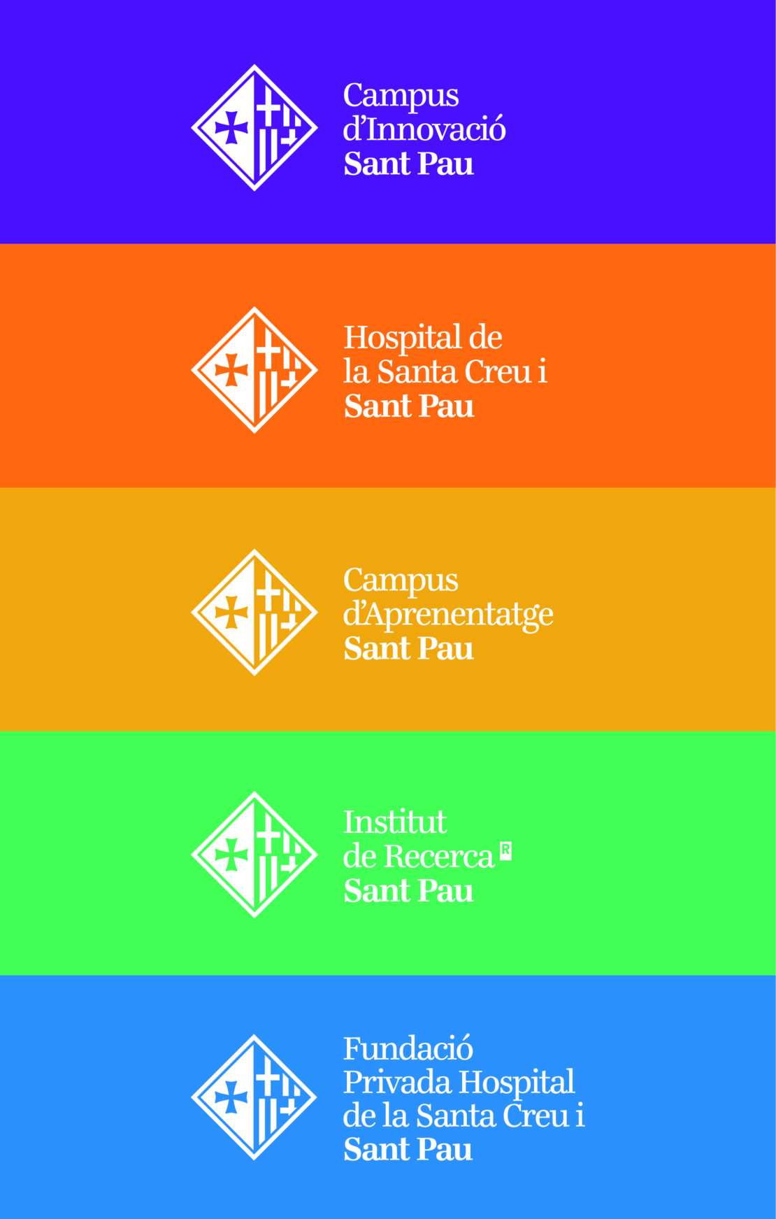
Knock joins the project at this point. We were the agency responsible for planning and executing an extensive strategic and branding exercise that made sense of the strategic plan: to create a coherent brand architecture, we redesigned the umbrella brand and created new visual identities for the different divisions of the campus.
We have built a new transversal narrative that unites all the brands in a single universe and highlights the history of the institution. The aim is to recover its personality and project it into the future.
Visual DNA
In order for the Sant Pau Campus Salut brand to relate coherently with the other previously designed identities that were different from each other, we carried out an exercise that we could call visual harmonisation.
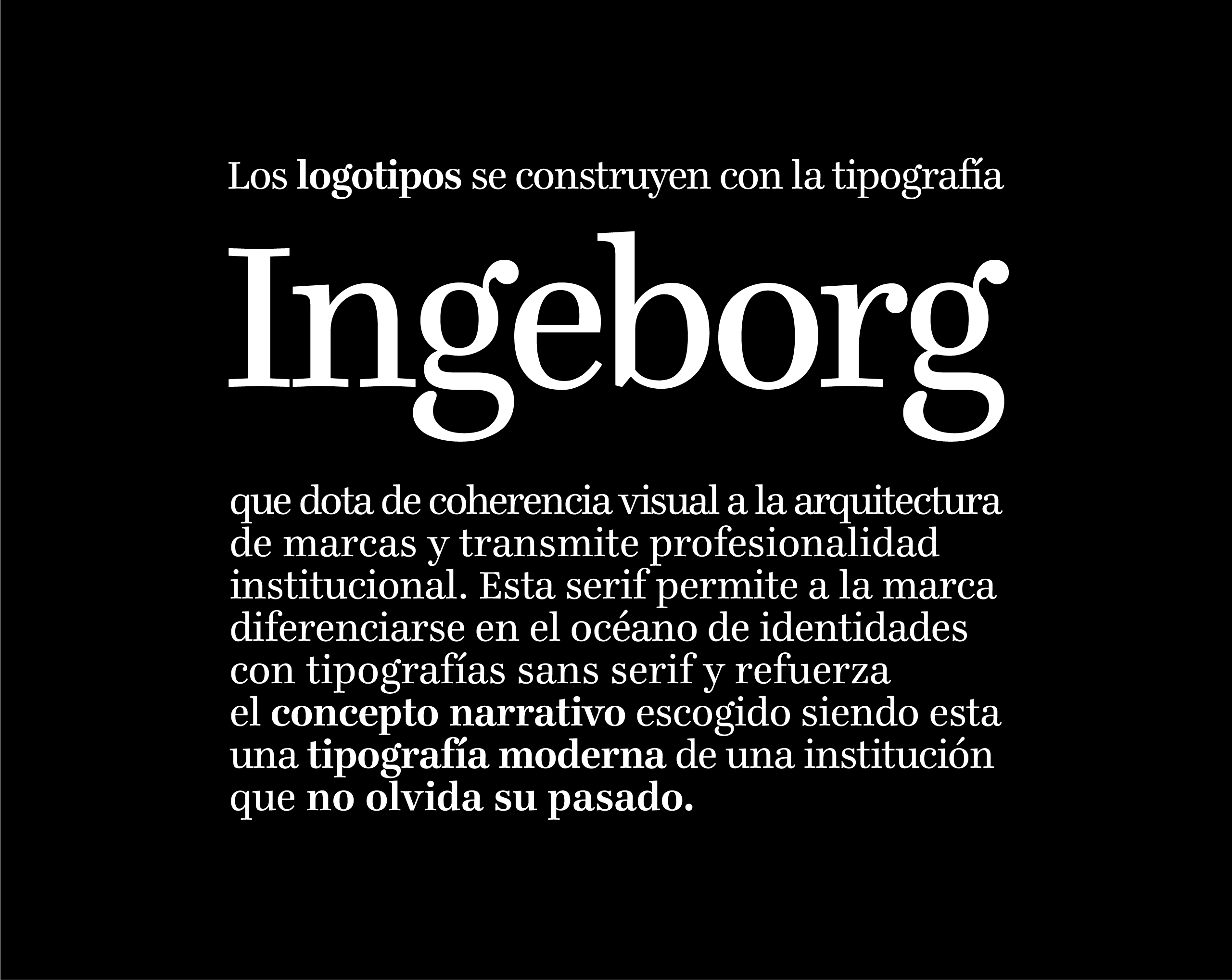
The Hospital de Sant Pau’s first identity, created 600 years ago, was based on heraldry. Since then, successive updates of the image have simplified it. Redesigning these identities represented an opportunity to visually reinforce the concept of history. Instead of following inertia, we have looked back, recapturing the heraldry in a perceptible way while adapting it to the needs of digital.
The colour spot that divides the shield, the adjustment of the lines and the negative use of a reinforced kicked cross, allows us to claim the personality without compromising its behaviour on screen or when it needs to adapt to very small sizes.
The new chromatic range inspired by the colours of the mosaics, stained glass and hydraulic tiles so characteristic of the Sant Pau Art Nouveau site. It’s not just a tribute, it’s about reinforcing the brand by staying true to its essence, from the narrative to the visual identity.
Copyright 2024 KNOCK BRAND DESIGN © | Legal notice | Cookies Policy | Privacy Policy
Las Cookies Necesarias son absolutamente esenciales para que el sitio web funcione correctamente. Esta categoría solo incluye cookies que garantizan funcionalidades básicas y características de seguridad del sitio web. Estas cookies no almacenan ninguna información personal.
| Cookie | Description |
|---|---|
| cookielawinfo-checkbox-necessary | Cookie propia, se utiliza para almacenar el consentimiento del usuario para las cookies en la categoría "Necesarias". |
| cookielawinfo-checkbox-non-necessary | Cookie propia, se utiliza para almacenar el consentimiento del usuario para las cookies en la categoría "No Necesarias". |
| PHPSESSID | Cookie propia, se utiliza para permitir que las variables de SESIÓN sean guardadas en el servidor web. Esta cookies es esencial para el funcionamiento de la web. |
| viewed_cookie_policy | Cookie propia, se utiliza para almacenar si el usuario ha dado su consentimiento o no para el uso de cookies. No almacena ningún dato personal. |
| wordpress_logged_in_ | Cookie propia, se activa después de iniciar sesión con una cuenta de usuario, se utiliza para indicar cuando se ha conectado y quién es el usuario activo. |
| wordpress_sec_ | Cookie propia, se utiliza como clave para controlar el acceso de un usuario al servicio de WordPress. |
| wordpress_test_cookie | Cookie propia, se utiliza para comprobar si las cookies están habilitadas en el navegador de los usuarios. |
Las cookies No Necesarias pueden no ser particularmente necesarias para que el sitio web funcione y se utilizan específicamente para recopilar datos personales del usuario a través de análisis, anuncios y otros contenidos integrados. Es obligatorio informar de su utilización y obtener el consentimiento del usuario sobre su uso.
| Cookie | Description |
|---|---|
| cli_user_preference | Cookie propia, se utiliza para registrar si el usuario ha consentido o no el uso de cookies. No almacena ningún dato personal. |
| CookieLawInfoConsent | Cookie propia, se utiliza para almacenar el estado de consentimiento de cookies del usuario. |
| test_cookie | Cookie de terceros gestionada por DoubleClick de Google, se utiliza para verificar si el navegador del visitante acepta cookies. |
| _ga | Cookie de terceros gestionada por Google Analytics, se utiliza para calcular los datos de visitantes, sesiones, campañas y realizar un seguimiento del uso del sitio para el informe de análisis del sitio. Las cookies almacenan información de forma anónima y asignan un número generado aleatorio para identificar visitantes únicos. |
| _gat_ | Cookie de terceros gestionada por Google Analytics, se utiliza para limitar la cantidad de datos registrados por Google en sitios web de alto volumen de tráfico. |
| _gid | Cookie de terceros gestionada por Google Analytics, se utiliza para almacenar información sobre cómo los visitantes usan un sitio web y ayuda a crear un informe analítico de cómo está funcionando el sitio web. Los datos recopilados, incluido el número de visitantes, la fuente de donde provienen y las páginas, se muestran de forma anónima. |